


I was quite satisfied with the critiques for my presentation. However, my tutors pointed out how even though my ideas I tried to convey in my work was shown as I spent most on my time working on the entrance and sleeping platform area of my site, I should’ve thought more of the rest of the space (bathroom etc.). I also should have put more detail in my section drawing for occupants to understand how environment Outside the building interacts with the interior of the space.
During the first week, when we were introduced to this project. In the presentation given by the tutors, the following slide stood out to me the most as I found it very interesting as the sleeping platform is able to be used in both spaces. I had decided to use this to inspire my project.
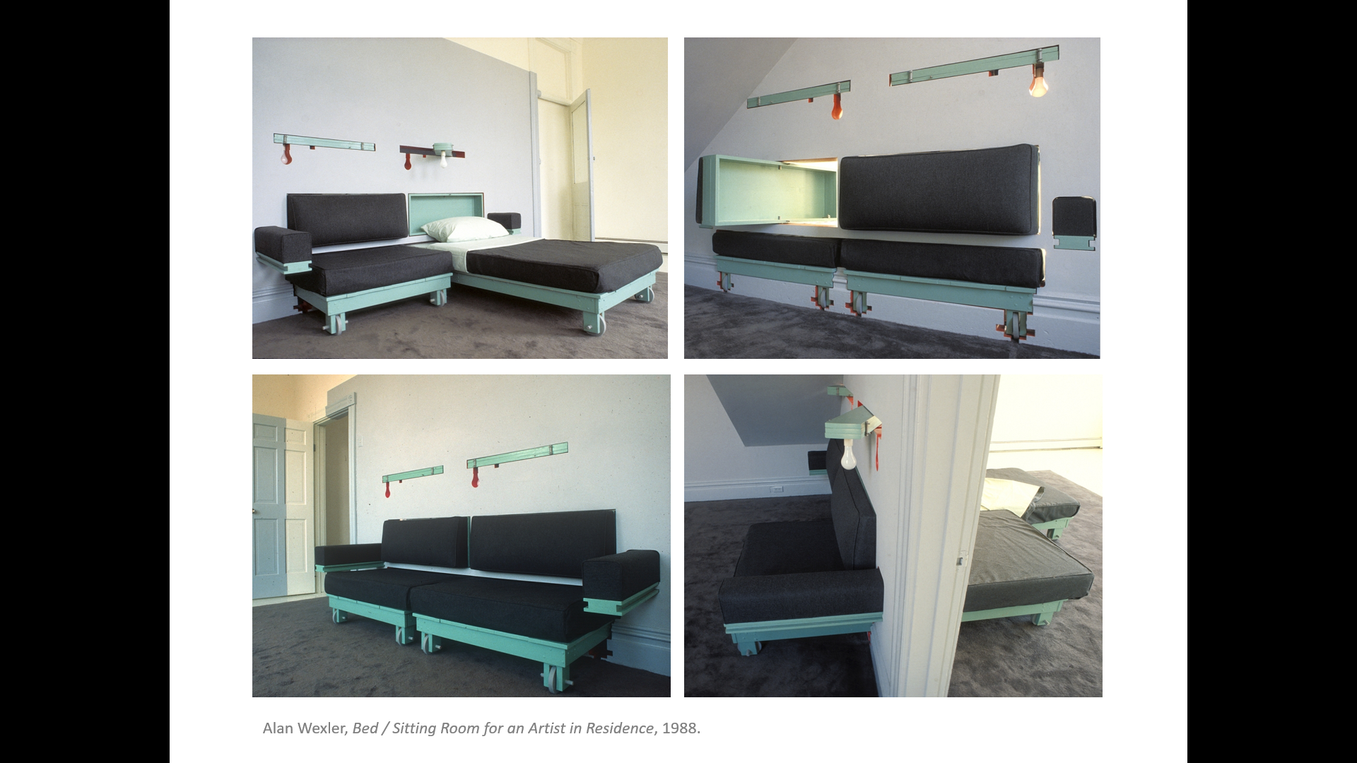

Wexler uses a smaller confined space within a larger space for minimal areas to be used allowing the occupant more room to utilize.


This is my prototype of my model. I hadn’t thought that much into it when I was making the model. However the wall gave the model the threshold aspect so I decided to include that. I had made the sleeping platform to spin. However, due to it’s lack of stability it tended to tilt even though it wasn’t my intention for it to.

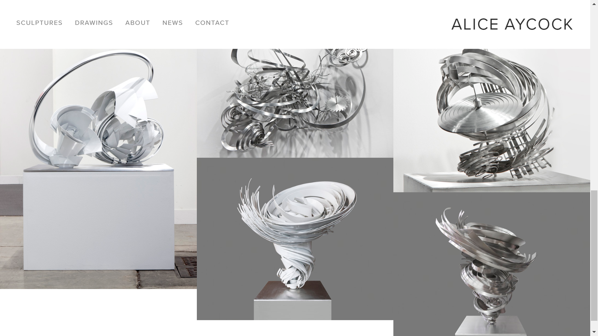
After seeing Aycock’s work of Whirls and Swirls and a Vortex on Water (2008) I had decided to keep the unintentional tilt of the sleeping platform as it seems really interesting and I thought with this when the strangers lie on the bed they would need both occupants to lie on the sleeping platform to allow them to feel comfortable. This would be a great start for these strangers to grow comfortable around each other.

Narration
Two strangers that are open to meeting new people but are fearful of initiating a chance of interaction. They both retire from the big city in solitary, into this space where they both meet. However, due to their timidity they lack interaction as they go with their day in the space. When the sun sets and they decide to retire into a slumber on the same sleeping platform. It is then, where they will be in a vulnerable position to be sharing the same space but will find comfort i the balance and presence of the other individual provides.
During this project I thought it is important for correct usage of materials, so I did my research. I had found out that natural materials are the to be used to create the comforting atmosphere I would like to provide for the occupants. The article said ” A thoughtful composition with views to nature can become a form of positive distraction, calming the senses by reducing anxiety.” This is relevant to my project as I would like to create a calming/comforting environment for the occupants so they are able to grow closer.
I had eventually chosen to use wood as the platform where the strangers would rest on and the bottom part holding the platform would be glass. I had chosen this as wood is a natural material so it would help the strangers feel calm and reduce their anxiety of sharing the same space. The glass was chosen because it represent vulnerability/transparency as this would be how the stranger would be feeling.
https://www.contractdesign.com/projects/
My site map displays the building the site is located in. I have included images of the view of the city taken over the pedestrian bridge of the city and the outside of the gallery with people outside, highlighting the business and movement there is. As I would like to continue this view as you enter the gallery but would come to a stillness and distancing away from the city life.


My 1:50 site model does not have much changes to the building. However, I had decided not to include some windows and removed one of the rooms. My reasoning for this is because the windows placed near the back of the site would bring in light into the space when I had intended to be dark. I had removed a room due to having no use for it and to create a larger space for the “stillness” aspect in the space.

The elevation drawing especially the right end of the drawing was too light so was hard to capture that part. I had adjusted the lighting after I had taken the photo so it would be should at least a little.
I have taken shots of the inside of the site to experience being inside. I have included people to document how the space is being used.


During my presentation Sue mentioned that I should have thought about how a person could occupy the space as to sleep/ wake in the space. The sculpture I have designed could be used for a person to rest and lay on as there are parts that lays almost flat on the ground. However, I should’ve thought more into that as the sculpture is very cursive so it may not be appropriate for a person to sleep on.
Site Map

I have used images and drawings from the day we took a trip to walk around in Albert park to AUT’s St Paul’s Gallery in WB building.
Threshold

I had drawn the plan of the gallery and have included the atmosphere of the gallery. I have shaded in the gallery to indicate that the space is rather dark but there is some light entering the gallery through the window. The lobby has some lights ahead to create a brighter space, however, the lights are quite dim so it conveys a feeling of comfort in the room.
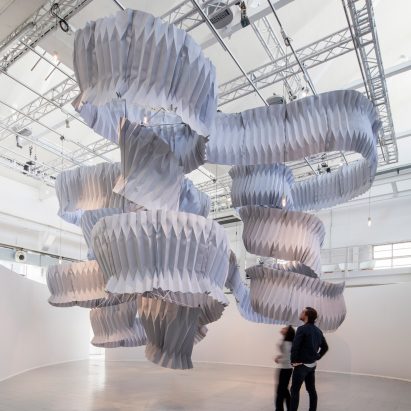
Alice Aycock has works in installation / sculpture / architecture. She appears to use the idea of movement/stasis as the sculpture is still but seems to have a movement that keeps going.
I’ve decided to try use the same focus on my installation in the gallery.

I plan to use a similiar concept from my project one and focus on the idea of movement/stasis.
https://www.dezeen.com/tag/kengo-kuma/
Kengo Kuma is an architect who designed this pollution-absorbing architecture. I found it quite fascinating how this simple design is used for a big cause. It corresponds with what I had planned for my design as well.
Section Drawing

Model


I have decided I would like the use plaster as the material for the installation, as I believe it would give off a clean finish to it. Also, When light shines through, it will reflect off the white area, which will make the space in the gallery more brighter.
However, I had used cardboard in the model as it is easier to work with for this project. But if it were a real installation then plaster would have been used.

As you could see the installation will be higher than a person’s height. I purposely made chose to made sure it fills the space, also making it high, so it would give a similar feel as if walking in the park as the installation would tower and surround the person walking among it just like the trees in the park does.

The space is rather dark but in the day when the sun shines through, creating shadows of the lines from the window but also will display waves of lines from the installation.
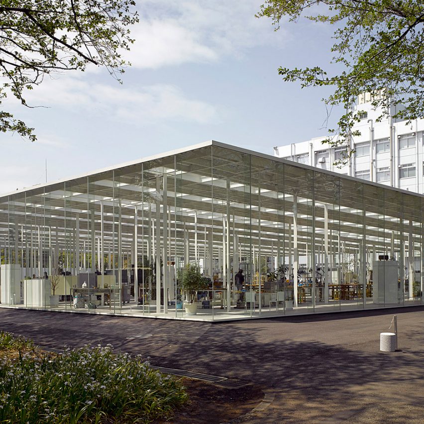
Junya Ishigami specializes in houses / large buildings / interior / furniture design. I mainly focused on his design of the Kanagawa Institute of Technology’s KAIT Workshop.
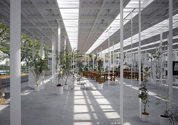
His work focuses on the lines inside of the building as contain more than 300 steel columns that differ in size, reminiscent of trees in a forest.
The glass walls of the building brings the idea of the threshold of sleep and wake from the thin boundary of the glass separating the inside and the outside.


This is the shot I had decided on for my final piece after taking many shots. Due to how a large amount of space is shown and the flowing of the paper gives of the element of wake.

This is my final model. I had continued to used similar structure to the previous mock model I had made. However, due to using more harder materials than in the previous post, some parts has changed. It doesn’t make much difference since it still has the same feel to it.
I have decided to combine these two mock models to see if it would work well together as one model contains a space where it conveys my sleep element well. My second mock model gives the flowing element like in my sketch so I proceeded to combine them together.


The Outcome:
Front view:

Top View:

I added copper wire and twisted it hoping it would give more of the wake element in it, which worked quite well.

The copper wire would move too much so I decided to temporarily clip on paperclips to hold the wire to the rest of the model. Surprisingly, the paperclip gave the model a bit of colour so the model wouldn’t look so dull and made me think that it could probably represent dreams as dreams can come in any sort of colour and feeling.

